While I sort out the next post, please check out what I am doing on Instagram at @peterflynnfotos.
Oct
26
2014
Bearpaw Lake
In Grand Teton National Park the eyes track the skyline. There is no doubt about this. And feet must answer for what the eyes insist on seeing ever more closely and clearly. Curiously, a goodly number of the day hikes in Grand Teton National Park measure in for the round trip route at just around eight miles – the eye makes extravagant demands…. Most of these routes run flat along their length, and thus make very doable day hikes. There are not less than a dozen of such treks, but our favorites of these cluster along the eastern side of the waterworks, providing the classic Teton water-and-peaks-‘o-granite views. Among these, the path from String Lake to Bearpaw lake may be the very best.
Click on pano thumbnail to view larger image
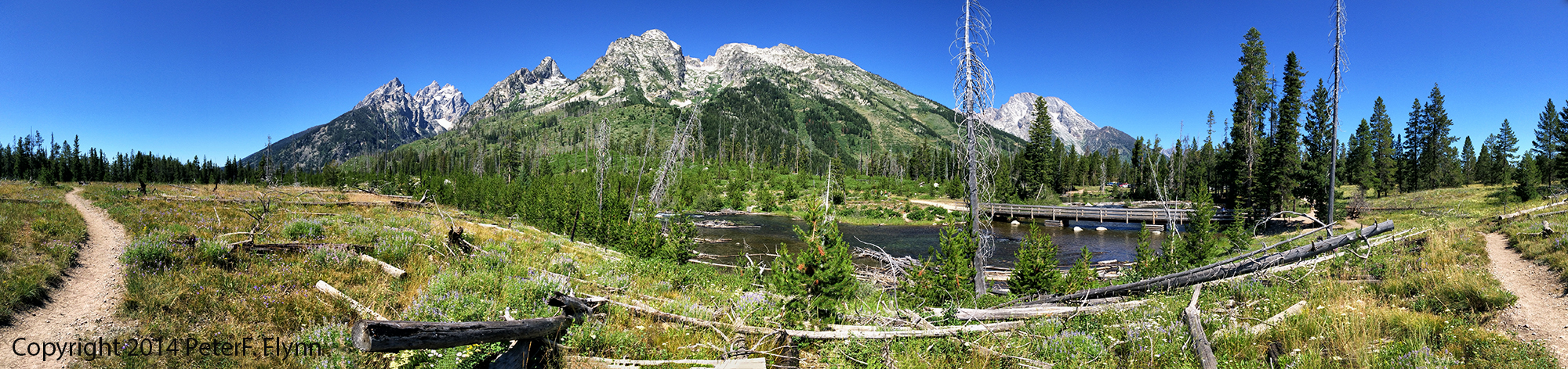
The path begins at the String Lake Trailhead, shown in the pano above (43.784416N, 110.727310W), and heads north along the lake shore. Alternative starts may be commissioned anywhere along the mile long eastern shore of String Lake. On a sunny day, you will find the picnicking areas along the shore of String Lake packed to the limit with enthusiastic visitors. In summer months, you will need to arrive before 9 am to secure a parking spot – no joke, the String Lake area is super popular.
Leaving the bulk of humanity behind, make your way north. You will most probably be accompanied lakeside by a small flotilla of canoes and kayaks paddling along the length of String Lake.
Click on pano thumbnail to view larger image
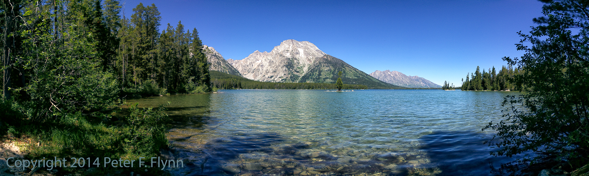
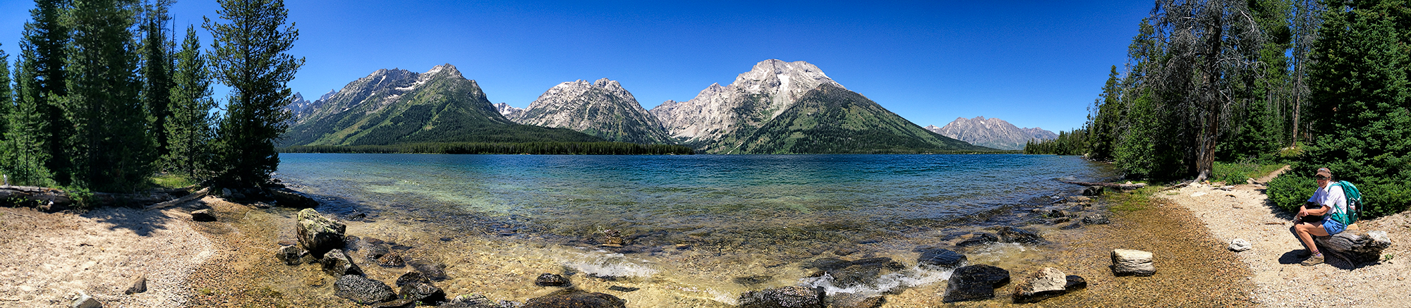
Near the north end of String Lake you will pass the portage between String and Leigh Lakes (43.796686N, 110.728348W). This is busy junction, with boats departing/entering String Lake before/after moving north and south along the portage. The portage from String Lake to Leigh Lake is about 225 yards, and gains less than 50 feet – all in all not an unpleasant lift. The southern bay of Leigh Lake is one of the most beautiful locations in the park (43.798275N, 110.727328W). Bordered in thick shore growth, the crystal clear water in the shallow bay opens up to the north with most excellent views of Boulder Island, the bulk of Leigh Lake, and towards the north end of the lake, Mystic Isle.
Click on pano thumbnail to view larger image
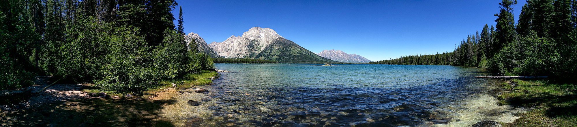
 The HP makes an appearance in the image above, shot towards the northwest from the eastern shore of Leigh Lake (43 48.2552N, 110 43.1717W). Note the presence of Mount Moran and Leigh Canyon in the background. The path continues, tracking north along the eastern shore of Leigh Lake. Leigh is a mighty Lake, and would take two days with a fair bit of bushwacking to circumnavigate. Our travels encompass only a quick three mile run up to Bearpaw Lake, which lies just a fraction of a mile north of the top of Leigh Lake. A highlight at the midway point is the the set of three campsites, 12A, 12B, and 12C. The sites are primitive, with very strict occupancy regulations, but offer some of the best lake shore camping anywhere. The pano below was recorded at site 12C.
Click on pano thumbnail to view larger image
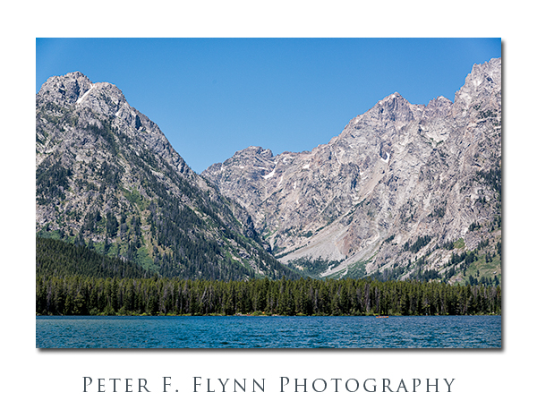
The image above provides a view into Leigh Canyon (43.8150N, 110.7558W). The canyon lies between Mt. Woodring to the south and Mt Moran to the north, and is (mostly) used by climbers seeking to access routes on the northern Teton summits. I am interested in a venture here next summer – since access is pretty much exclusively by (private) boat, I have to imagine that the canyon is relatively wild and uncrowded. The shot below shows one of several bear boxes and hanging rigs that lie near the back of the Camp 12 sites. Given the relative remoteness of the location, I would guess that bears could be frequent visitors to the camp.
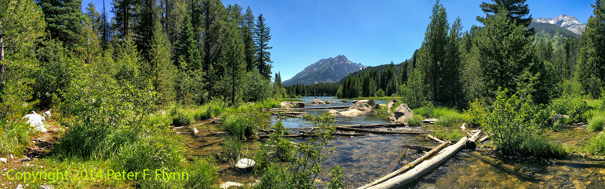
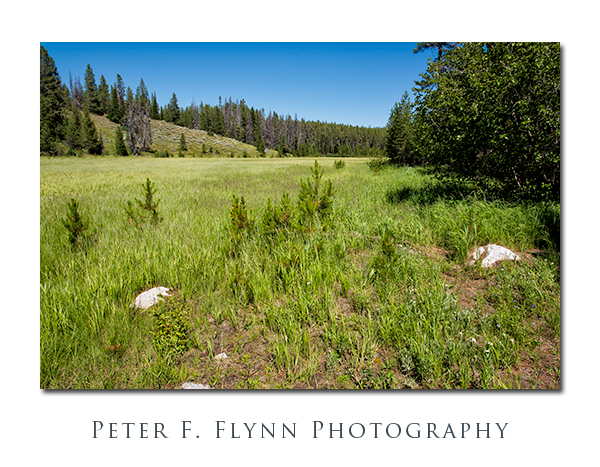
Bearpaw Lake (shown below) is a small lake that is isolated from the Jenny-String-Leigh Lake system. It lies nestled (together with Trapper Lake) in a lovely basin in the relatively untraveled region of the park. Although it is highly unlike that you would find your self completely alone here, solitude seekers will be encouraged by a very low head count. There is one large campsite available on high ground between the bulk of Bearpaw Lake and a minor, heavily silted, arm – a bit too right in the middle of things for my taste, but again, the traffic here is low.
Click on pano thumbnail to view larger image
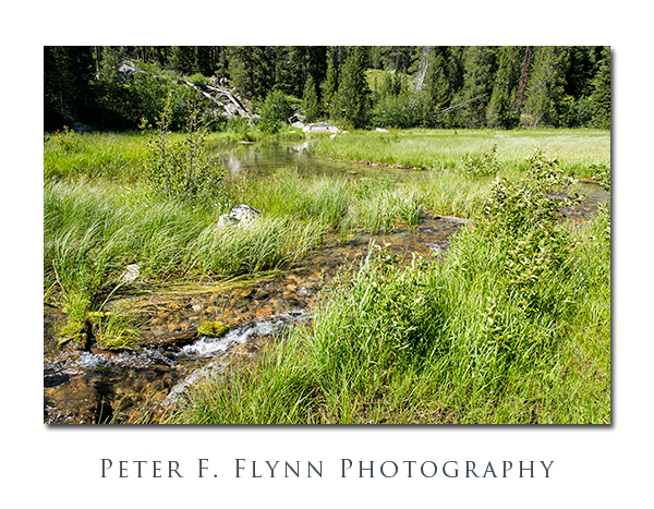
A small stream exists the northern tip of Bearpaw Lake (43.8317N, 110.7280W), and leads north into a heavily silted corner of the lake.
Click on pano thumbnail to view larger image
Images in this entry were recorded on July 26, 2014, using the Nikon D810 with the AF-S NIKKOR 24-120mm f/4G ED VR. This combination represents the state of the art in outdoor photographic gear. I’ve used it all, and I will take this simple setup above anything other one-camera + one lens setup. Panoramic images were recorded using the Apple iPhone 5s with the Autostitch app.
Image
Copyright 2014 Peter F. Flynn. No usage permitted without prior written consent. All rights reserved.
Sep
07
2014
Hermitage Point Trail – Grand Teton National Park
Click on pano thumbnail above to view larger image
Grand Teton may very well be the most versatile park in the NP system. Within park boundaries, one can tackle classic big wall rock climbing, ride your bicycle along paths the run below some of the most dramatic peaks on earth, float a legendary river, or paddle around in beautiful mountain lakes of remarkable clarity.
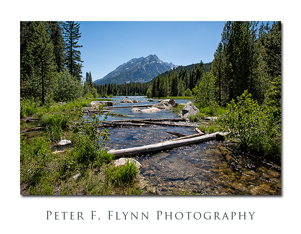
The northern portion of the park is dominating by Colter Bay, with its many boating options. While these boating opportunities are unique and wonderful, they are not the only reason to spend some time in this part of the park. Some of our favorite hiking trails start in the southern end of the Coulter Bay complex, near the boat launch. The trail to Hermitage Point provides an excellent chance to experience the northern park vistas along a flat and fast track out and back to an excellent terminus on the shore of Jackson Lake. Along the way, you will also be able to make visits to two other smaller Lakes, Heron Pond and Swan Lake.
Click on pano thumbnail above to view larger image
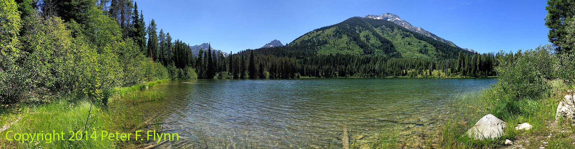
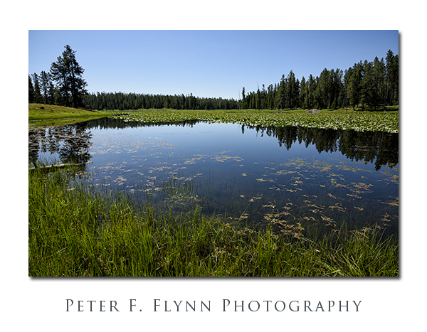
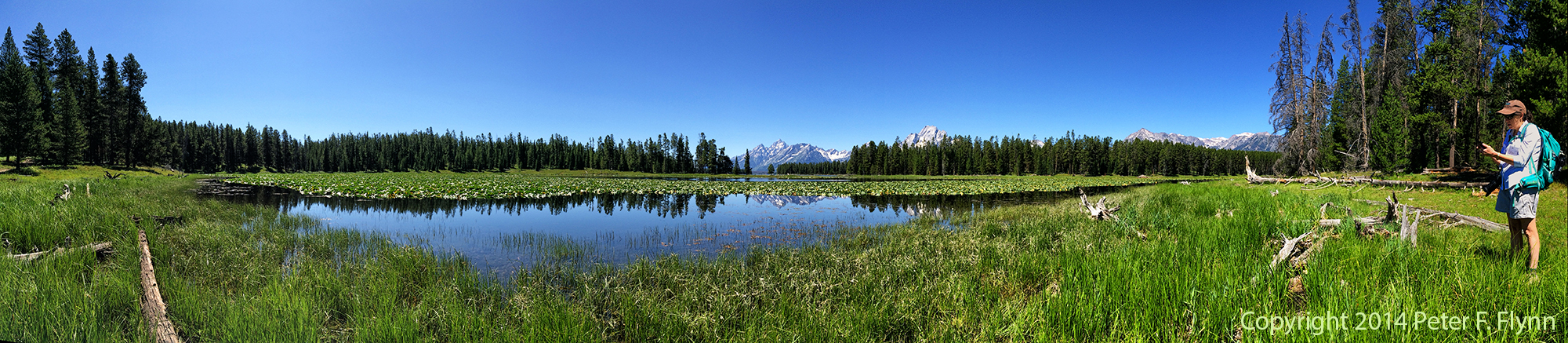
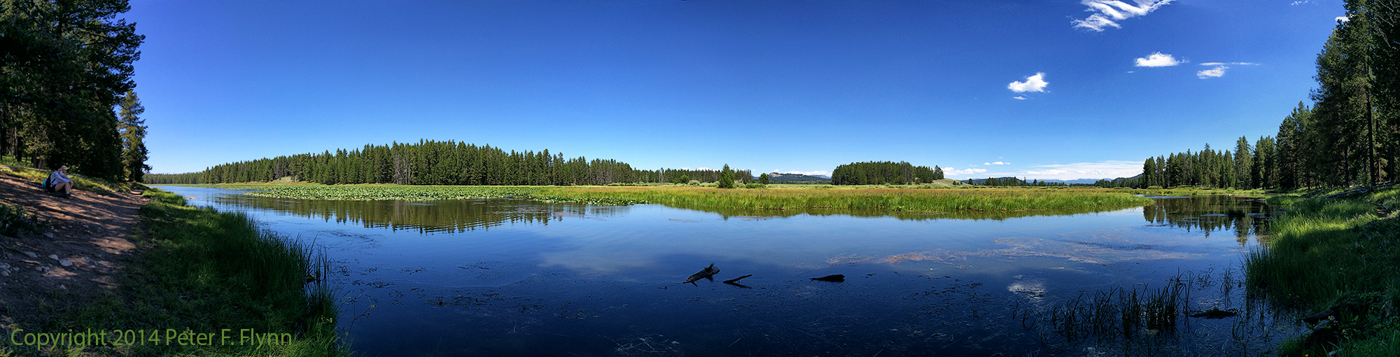
The pano above and the image below were shot at Heron Pond. The trail passes along the eastern shore of the pond, which provides stunning views of the northern portion of the Tetons, including most notably, Mount Moran. The pond is filled to about 50% of its surface with some species of water lily – and I am not certain that these are proper lilies, but anyway, some form of aquatic veg.
Excellent time can be made along the Hermitage Point trail, which gains/loses only a couple of hundred feet along the 4.4 mile trek. Much of the trail is either close and above Jackson Lake, or runs very near to the shore.
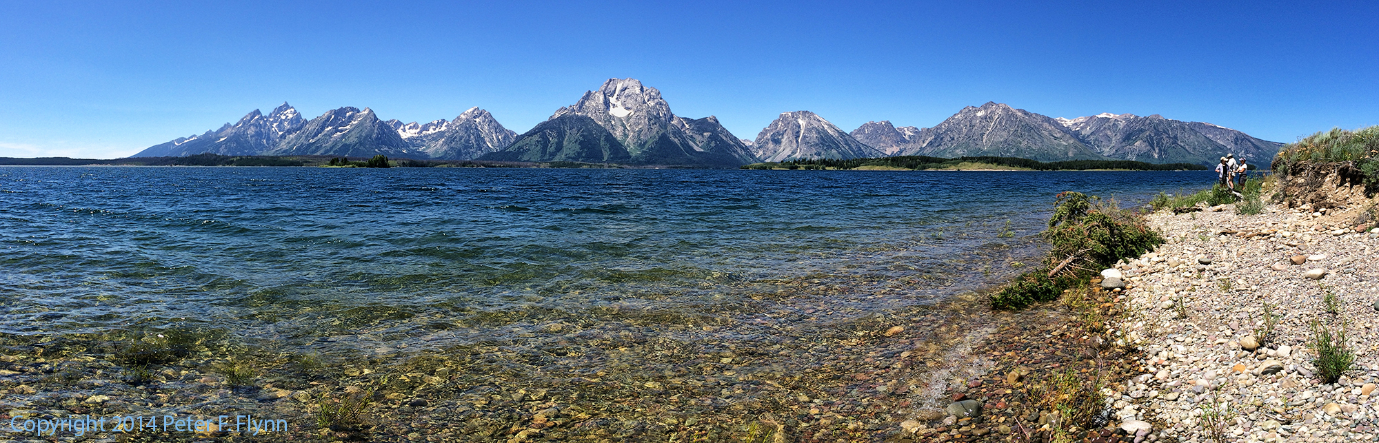
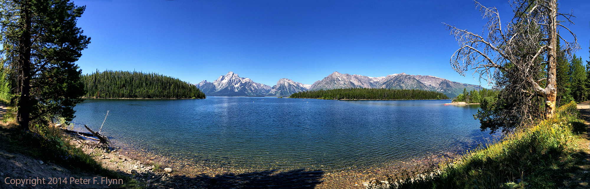
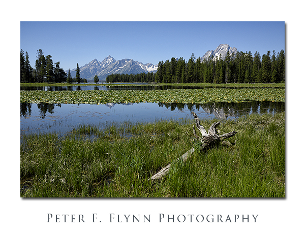
Click on pano thumbnail above to view larger image
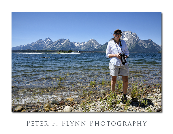
The pano above, and image of the HP below, were recorded at Hermitage Point. The approx 4 mile distance is just long enough to insure that you will never have to share the point with more than a couple of other people. Passing power boats, as shown in the image of the HP provide a curious contrast to the otherwise natural wonders visible from this viewpoint.
Click on pano thumbnail above to view larger image
A variation on either the route out or back leads you to Swan Lake, shown above, which is another lovely lake near Colter Bay. This is a mature Lake, wrapped in shade from firs and pines that run right down to the shoreline and nearly filled with water lilies – an especially welcome rest stop on an afternoon return.
Images appearing in this entry were recorded using either the Nikon D810 and the AF-S NIKKOR 24-120mm f/4G ED VR, or the Apple iPhone 5s (all panos).
Copyright 2014 Peter F. Flynn. No usage permitted without prior written consent. All rights reserved.