Posts Tagged ‘B&W’

Nik Silver Efex Pro 2: Contrast Controls

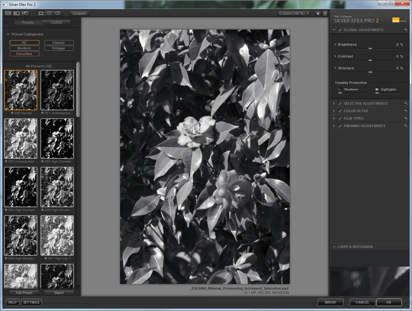
In a previous entry we considered the Brightness controls in Nik Silver Efex Pro 2.  In this entry we consider the other major component of tone control, contrast adjustments.  As with the Brightness controls, the contrast adjustment controls have undergone a significant redesign.

The source image for this discussion, shown above, was recorded at Cathedral Park in Portland, OR, at about noon on February 20, 2011, using the Nikon D3s and the  AF-S 70-200mm f/2.8G ED VR lens at 165mm.  Exposure was f/11 and 1/40s, ISO at 200.

Processing on the color version of the Camellia included white balance adjustment based on the WhiBal reference card (see the February 25 entry for a shot of the HP holding same), highlight recover in the RAW conversion (+13), and curves adjustments of the red and green channels followed by conversion of that layer to Luminosity blending mode.  Capture sharpening, midtone contrast enhancement, and output sharpening (for web) were applied using PhotoKit Sharpener 2.0 (the new version of PhotoKit Sharpener is really very good).  The version of the image that we will use for a workup in Silver Efex Pro 2 is a minimalist version of the image above, which leaves out the curves adjustment and the midtone contrast enhancement, but adds a Hue/Saturation adjustment to boost the color saturation (+25 on the Master control) prior to BW conversion.

The initial conversion into BW using Nik Silver Efex Pro 2, shown below, produces a very nice starting point – solid initial conversion is a strong point of Silver Efex Pro.

Contrast Tone Controls

In addition to global control of brightness, the Contrast control now has three parametric control elements: Amplify Whites, Amplify Blacks, and Soft Contrast.  For global Contrast as well as for Soft Contrast, the operation range of the tone controls ranges from -100% to +100%, whereas for Amplify Whites/Blacks, the range is from 0% to 100%.

We first consider the effect of the global Contrast adjustment.  I’ll show the versions with the global Contrast set at -40%, -20%, 0%, +20%, and +40%.

For the image below, global Contrast was set at -40%.


For the image below, global Contrast was set at -20%.


Reference Image (global Contrast set at 0%).


For the image below, global Contrast was set at +25%.


For the image below, global Contrast was set at +40%.

The global Contrast tone control thus functions as one would image, adjusting the overall contrast of the image.


Parametric Contrast Tone Controls

The parametric Contrast tone controls supports enhanced adjustments of image contrast, which as for the Brightness controls, should reduce or eliminate the need to make selective adjustments to image brightness.  To demonstrate the parametric controls,  I’ll again show the reference image, followed by variations in the Amplify Whites, Amplify Blacks, and Soft Contrast parametric controls.

Amplify Whites/Blacks Control

Reference Image: Global Contrast control at 0%, Amplify Whites/Blacks controls at 0%


Amplify Whites control set at +40%, Amplify Blacks control set at 0%

The influence of Amplify Whites is to increase the brightness in the darker tones while preventing the highlights from blowing out.


Amplify Blacks control set at +100%, Amplify Whites control set at 0%

The effect of Amplify Blacks for the source image is extremely subtle – there is some darkening in the darkest tone, with no apparent change in the lighter tones.


Amplify Whites at +40%%, Amplify Blacks at +100%


Soft Contrast Control

The official Nik description of Soft Contrast is, well frankly, a little soft:

The Soft Contrast slider’s goal is to provide a different approach to contrast, one that can be less harsh than the effect of traditional contrast. Moving this slider to the right introduces a moody contrast with soft transitions between areas. Moving this slider to the left reduces contrast while still maintaining edge contrasts.

The comment that the Soft Contrast control is less aggressive than the standard Contrast control seems to be accurate, as does the claim that adjusting the slider to the right reduces contrast while maintain contrast nears edges (a pretty subtle effect, but interesting).  The notion of ‘moody contrast’ is a not a very useful phrase though – I’ll try to generate a more quantitative description of the effect.

Soft Contrast control set at -40%


Reference Image: Global Contrast control at 0%, Soft Contrast control at 0%


Soft Contrast control set at +40%


In the next entry, I’ll review the Structure controls in detail.

Copyright 2011 Peter F. Flynn. No usage permitted without prior written consent. All rights reserved.


Notes on Nik Silver Efex Pro 2: Introduction

I’ve decided to make up some notes for myself on the new version of Nik Silver Efex Pro.  I’m posting them here so that I can access them anywhere – and so, obviously, can you.  Feel free to send corrections, opinions, et al.

The reference image for these notes will be the shot of a Camellia bush shown above.  The image was recorded at Cathedral Park in Portland, OR, at about noon on February 20, 2011, using the Nikon D3s and the most excellent AF-S 70-200mm f/2.8G ED VR lens at 165mm.  Exposure was f/11 and 1/40s, ISO at 200.

Processing on the color version of the Camellia included white balance adjustment based on the WhiBal reference card (see the February 25 entry for a shot of the HP holding same), highlight recover in the RAW conversion (+13), and curves adjustments of the red and green channels followed by conversion of that layer to Luminosity blending mode.  Capture sharpening, midtone contrast enhancement, and output sharpening (for web) were applied using PhotoKit Sharpener 2.0 (the new version of PhotoKit Sharpener is really very good).  The upper of the two large flowers near the center is pretty high key, and although I could have normalized the brightness, I deliberately left it bright since that the way I saw it.

The version of the image that we will use for a workup in Silver Efex Pro 2, see below, is a minimalist version of the image above, which leaves out the curves adjustment and the midtone contrast enhancement, but adds a Hue/Saturation adjustment to boost the color saturation (+25 on the Master control) prior to BW conversion.

I start Silver Efex Pro 2 using the Nik Selective Tool, and by default the image is rendered using the Neutral Preset as shown below – click on the image to see a larger size version (opens in new window/tab).

Click on the image to see a larger size version

The default conversion (Neutral) actually looks pretty promising right from the start as shown below.

Typically, the first adjustments made to a converted image should involve tonal adjustments, e.g., brightness and contrast.  The Tone Control set from the original Silver Efex Pro, hereafter SEP, included Brightness, Contrast, and Structure controls, and semi-hidden in the Film Type section, a Tone Curve adjustment tool.  The Brightness and Contrast controls function in ways that will be familiar to anyone who has conducted even basic photo processing.  The Structure control was never been well-documented by the official Nik SEP software manual, which only suggests that the control emphasizes or deemphasizes ‘fine details throughout the image’.  According to the Lesson Site for SEP2, Structure control applies some sort of microcontrast enhancement that is restricted to areas within tonal regions, and that specifically avoids contrast adjustments at tonal interfaces (edges.)  This  remains unnecessarily cryptic in my book.  The effect is similar in some respects to the sort of enhancement one gets by applying a Photoshop Unsharp Mask contrast enhancement with values like 20, 50, and 0, respectively, for Amount, Radius, and Threshold.  Regardless, the ability to control contrast in this way in real-time is very powerful.

In Silver Efex Pro 2, hereafter, SEP2, the Brightness, Contrast, and Structure controls have been expanded to included parametric controls, which significantly expands the ability to fine tune the influence of the tone controls.  In the new feature set then, one can isolate adjustments, for example, to only the Highlights, leaving the midtone and shadows regions unaffected.

The parametric controls will be familiar to anyone who has used the ACR Tone Curve tool shown below.

In the next entry, I’ll review the Brightness tone controls in detail.

Copyright 2011 Peter F. Flynn. No usage permitted without prior written consent. All rights reserved.


Fruita Schoolhouse

Capitol Reef National Park.  Although it is the equal of any of the scenic wonders of the Grand Staircase, it is generally far less crowded than Zion or Bryce Canyon.  This is due to the simple fact that it lies a little further on down the road, and is therefore left off many a family’s itinerary.  The area is not recorded on official maps before 1872, and the road from Richfield to nearby Torrey was not paved until 1940.

In spite of its remote location, by 1880 Mormon settlers had established a farming and ranching outpost that would eventually acquire the name Fruita.  An apt name, for fruit orchards planted by the Mormon pioneers are still thriving here.  Capitol Reef was established in 1937 as a National Monument (NP in 1971), and by the late 1960s the Park Service had acquired most of the privately held property.

One of the more interesting remaining pioneer buildings is the one-room Fruita Schoohouse shown above.  The structure is listed on the National Registry of Historic Places, and the specific entry may be found here.

The image of the schoolhouse was recorded at about 16:00 MDT on July 22, 2010, using the Nikon D3s and the AF-S NIKKOR 16-35mm f/4G ED VR lens at 16mm.  Exposure was f/16 and 1/320, ISO 800.  Image converted to BW using Nik Silver Efex.

The boulder inscribed with the name of the location lies just behind the schoolhouse (north).  In addition to the engraved ‘Fruita Grade School’, there are a plethora of other minor inscriptions.  Same exposure and processing parameters as for the schoolhouse image.

Images like the schoolhouse have become prime candidates for what has become known as one-shot HDR processing.  Using this method, single RAW files are converted into HDR images as shown below.  Images converted to HDR using Photomatix Pro 3.

The results are almost always processed using Details Enhancer mode (in Photomatix parlance) to produce a characteristically illustrated or ‘painterly’ representation of the image.  I don’t know.  Although I reject all impressionistic representations on the basis of principle, that is not really the issue here.  There is something simultaneously intriguing and unsettling about this representation.  Frankly, it is certainly more compelling than the BW representation in many instances.  Anyway, if you like this sort of thing, I invite you to enjoy the effort.  At any rate, I cannot resist the opportunity of exploring new methods, so you’ll see more of this stuff.

Copyright 2010 Peter F. Flynn. No usage permitted without prior written consent. All rights reserved.