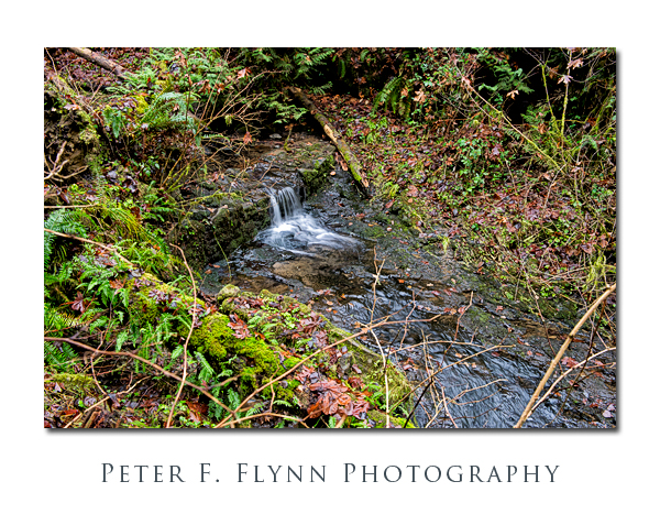
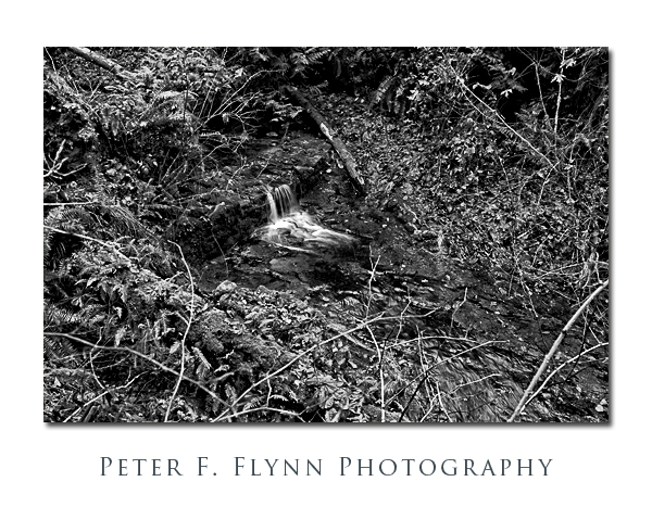
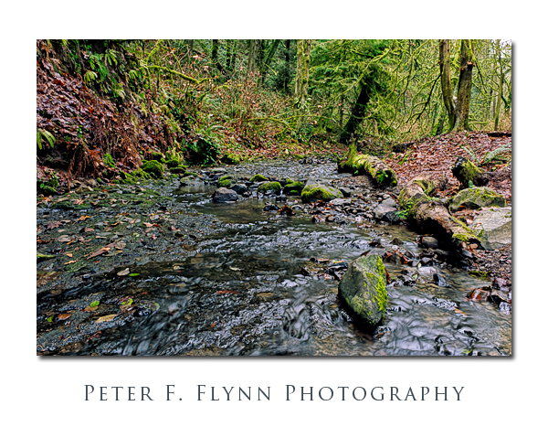
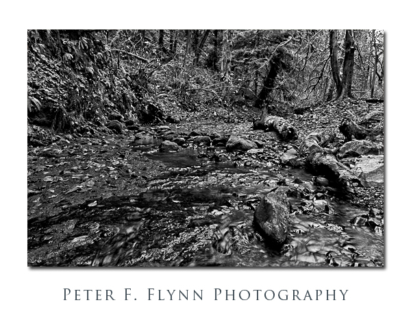
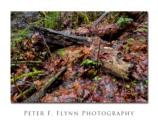
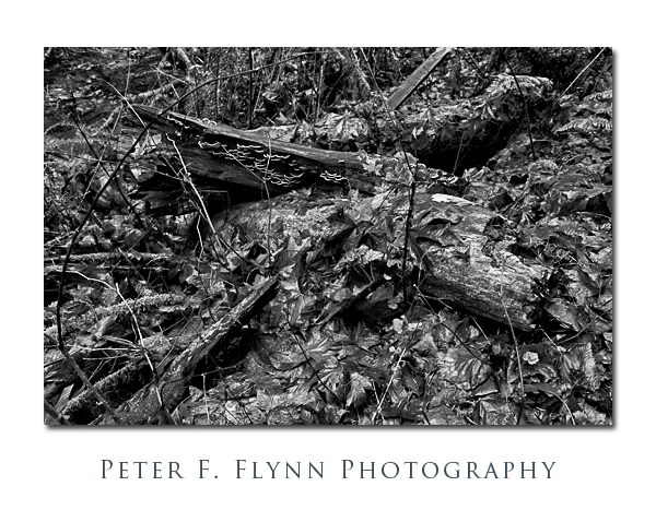
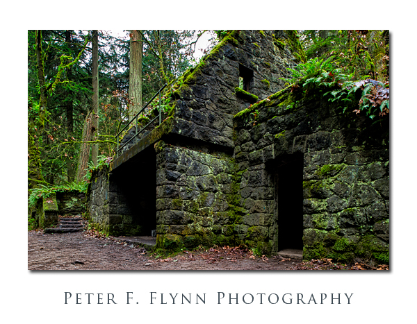
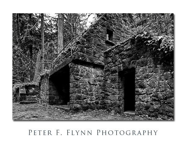
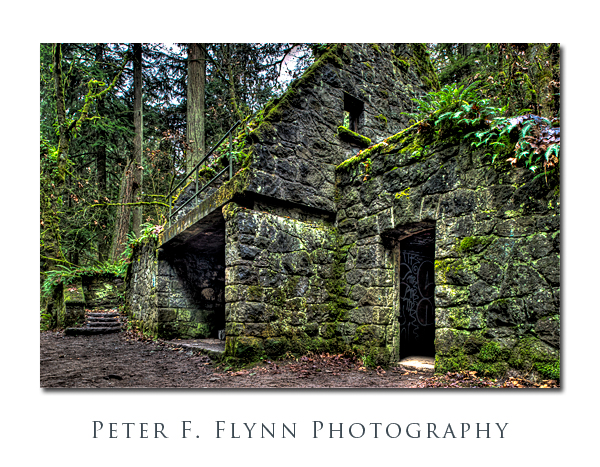
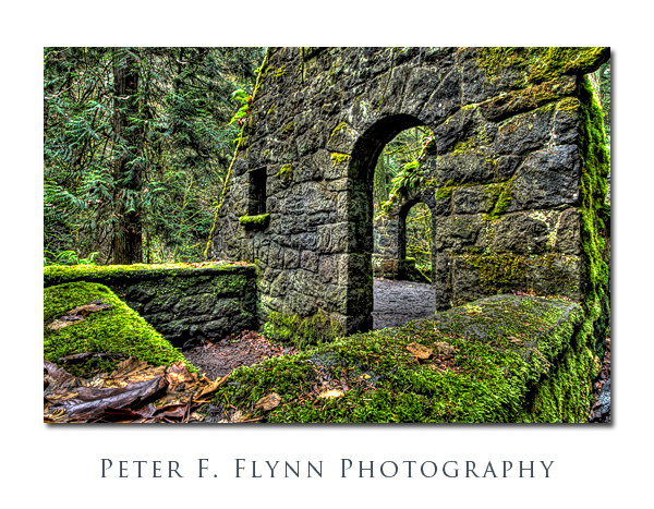
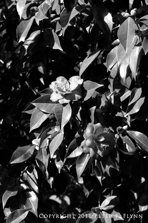
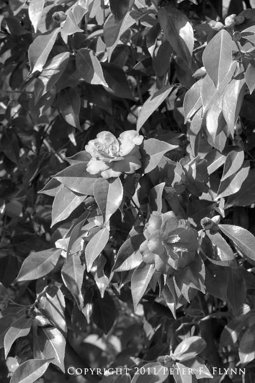
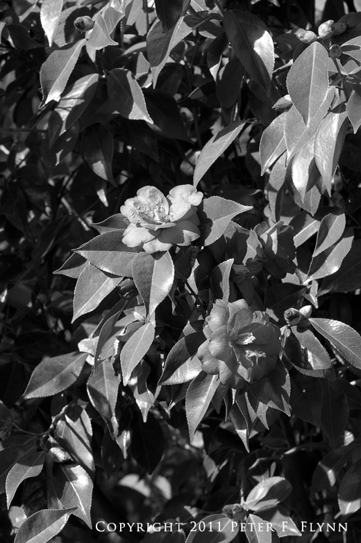
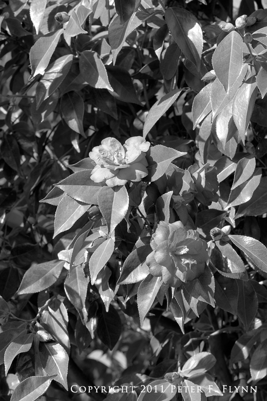
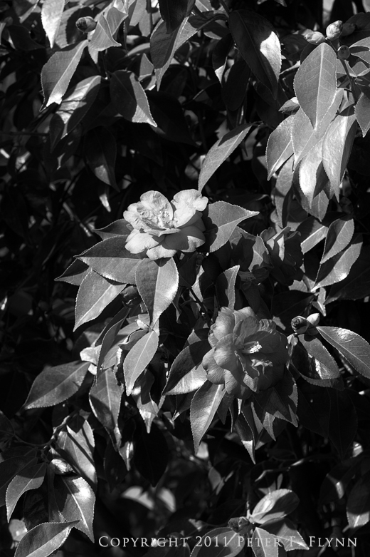
In artistical parlance, a study is a work made in preparation for a target result. Perhaps something like a sketch prior to an oil rendering, or a painting in advance of a sculpture – these sorts of things. Of course the study itself can be art too, and can sometimes capture the raw power of an idea more fully than the finished piece. In this entry I’ll present a brief review of some visualization concepts that I worked through for a series of images I recorded in Macleay Park.
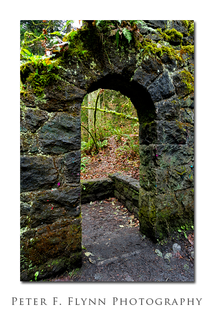
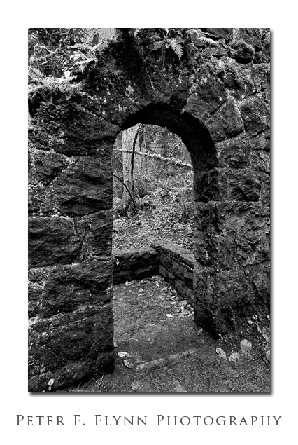
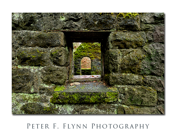
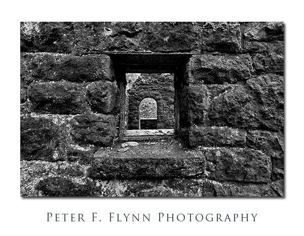
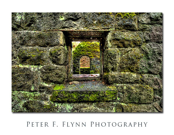
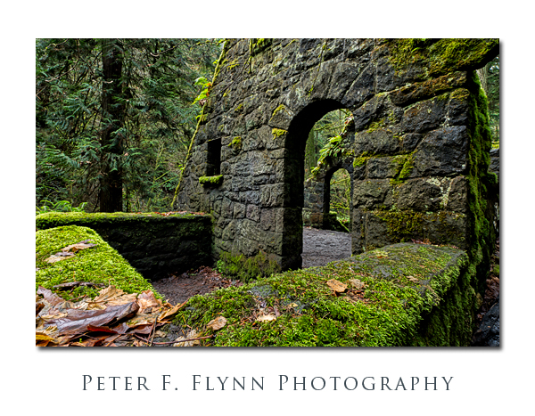
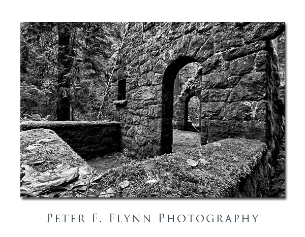
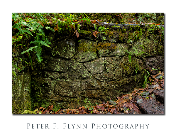
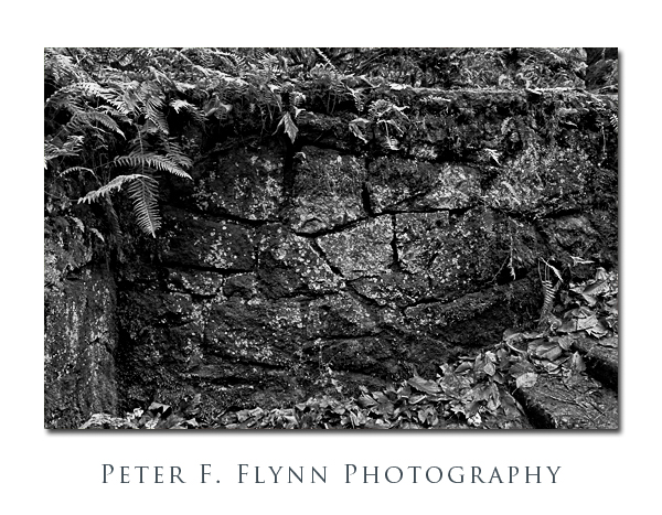
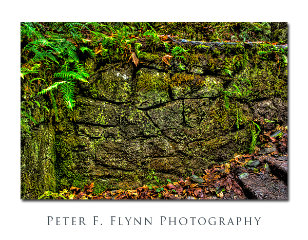
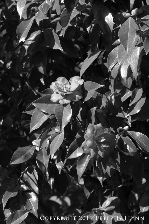
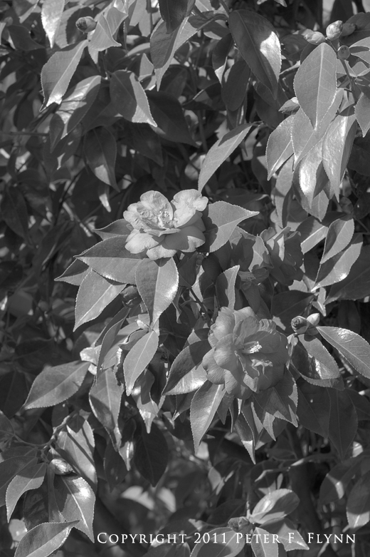
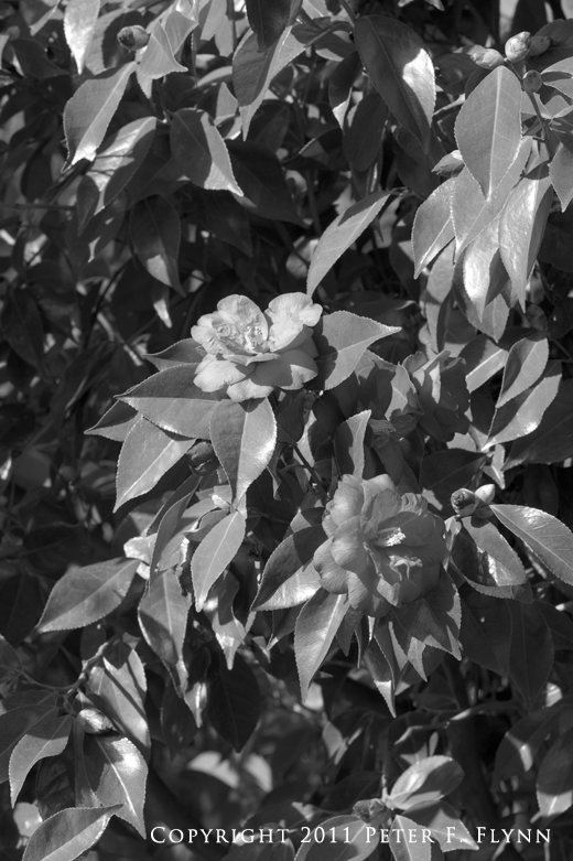
Modern digital imaging technology provides tools that make it possible to render images in ways that are only bounded by the imagination of the artist. Some of these advances, as in control over global exposure and contrast are directly related to their analog counterparts of the film era. Other methods, such as advanced masking, microcontrast adjustment, and high dynamic ranging techniques, are either completely new, or are so much better than the analog equivalents that they might as well be thought of as completely new. In this study I am considering the effects of rendering the image as a straight-up color image; as a BW version; and as a color version with expanded rendition of the luminosity, e.g., HDR. Images are grouped in sets of three in that order: color, BW, HDR.
Let’s take a look at the subject. Macleay Park is part of the vast, sprawling expanse of the Forest Park complex in Portland, OR. The park is confined within Balch Gulch, which is a ravine that was first owned and settled by Danford Balch. The land was later purchased by Donald Macleay, who held the land for several years before deeding the property to the city in 1897 in commemoration of the 60th anniversary of Queen Victoria’s reign. A colorful alternative account suggests that Macleay deeded the land to the city in order so that he should not have to pay tax on a parcel that he thought was incapable of generating income.
Macleay Park is always dark with the dense overgrowth of PDX-area forest, but in the winter months due to shedding of leaves by the high percentage of decidous trees, it is actually more lightsome than in late spring or summer. Thus, a bright mid-winter day is an opportune time to visit the park and make a study of the area. Indeed, there is much here that is worthy of photographical contemplation. The lovely little stream named Balch Creek that runs down through the ravine has exposed the basalt bedrock, which makes an excellent contrast element for the bushes and the trees and the moss which is everywhere. There is much evidence of efforts to develop the land for profit, most notably, the remains of a flume near the mouth of the ravine that was once used to wash soil down into lowlands as fill. Much of this random mischief occured at the end of the 19th century, and the implements have been retaken by natural process to the point where it all seems almost organic.
One of the highlights of a visit to Macleay Park are the ruins of 1930’s era structure that was built by WPA workers. The building spent much of the 20th century rather ignobly, as a restroom. No matter, and like much of WPA construction in Oregon, the overall structural theme seems to be that of timelessness, as if a thing was meant to be built one time, for all time. The foundation of the structure was built as many WPA-era structures were, largely of natural materials, in this instance, basalt blocks. Much of the stone part of the structure remains intact, and visitors can explore stairways and archways leading to the main deck.
Much of the exposed surfaces of the ruins are covered in a thick layer of bright green moss, which makes it difficult to intuit the age of the place. Although the ruins are actually only about 80 years old, tramping around inside gives one the same impression that you get from wandering arround in the remains of a medieval castle. Close inspection of the walls reveals the skills of the stonemasons that built them. The walls run straight, and they are all true from base to height, and yet are composed of stones in all shape and sizes – the only exception being the curved archways, which are composed of perfectly-honed blocks in classic keystone construction.
The straight color images here seem to provide the most photo-realistic depiction of the scenes – at least as far as memory serves – but of course it’s not that simple, if it’s art that is… There is a lot of chatter these days about what is appropriate in terms of processing images. There are those who would have us believe that only the most realistic depictions are valid, but this is simply ignorant and/or small-minded. Images have *always* been manipulated in processing to suit the photographer’s goals. Certainly the processing tools are much better in the digital photography age, and that makes manipulation easier and thus more likely that we might do things that may offend sensitive eyes. In skilled hands however, modern image processing tools are perhaps what best recommends digital capture.
The color images were converted from raw using ACR 6.6. Further processing to enhance global contrast and microcontrast was accomplished using two Nik Software products: Nik Viveza 2 (boosting global Contrast and Structure, which is the microcontrast adjustment) and Nik Color Efex Pro 4 (Tonal Contrast). The BW images were based on the same raw conversion setting as was used for the color images, except that the saturation was increeased to between 30 and 40. The BW conversion was made using Nik Silver Efex Pro 2, based on the High Structure preset. Additional contrast enhancement was made using Color Efex Pro 4, again using the Tonal Contrast control.
For the HDR image conversions one of two approaches was used. In one method, the individual images in the HDR composite were converted from raw format into tiff images in ACR prior to HDR conversion. This was done so that the lens correction and straightening tools in ACR 6.6 could be employed. Otherwise, raw images were converted as part of the HDR assembly process. In both cases HDR images were rendered using Photomatix Pro 4.4.4 (HDRsoft). There are three methods available for HDR image generation: Detail Enhancer, which can produce images that range from photo-realistic to highly stylized; Tone Compressor, which generally produces the most photo-realistic HDR images; and Exposure Fusion, which is not strictly an HDR method, but instead expands dynamic range by combining multiple selectively-masked source images. Within the Detail Enhancer and Tone Compressor modes, there is wide latitude of processing strategies. For some, optimization of HDR images has been problematical, however the recent implementation of presets in the Photomatix converter has made HDR refinement much more accessible. For the HDR images included in this entry, Detail Enhancer conversion was used, with the Painterly preset selected along with a boost in both the White Point and Black Point (clipping) controls to the maximal values of 5%. Finally, Nik Clor Efex Pro 4 Tonal Contrast was used to expand the tonal microcontrast. Capture and output sharpening on all images was applied using PixelGenius PhotoKit Sharpener 2.
Does any single processing method consistently win out here? I don’t believe so. Although each processing method; color, BW, HDR, was applied in very similar ways for all sets, the effects vary in ways that are quite unpredictable based on the scenic elements, luminosity, fundamental contrast, etc. I must also add that the BW version of all images suffer most from the small sizes used in the post. Something about the subtlety of tonal gradation appears to be preferentially lost in the size reduction for the monochrome version. At any rate, what was essential here was that each capture event was recorded using sufficient source images so as to provide a choice of the best single image for the color and BW versions (generally the +1.0 EV image) as well as to provide proper grist for the HDR conversion (5 images in 1 EV steps or 7 images in 1 EV steps).
Images in this entry were recorded on December 23, 2011, using the Nikon D3s and the AF-S NIKKOR 24-70mm f/2.8G ED lens at various focal lengths. A Gitzo model GT2540LLVL tripod was used with the Markins Q10 ballhead fitted with an RSS PCL-1 panning clamp – this setup is the famous Frankenpod.
Many Thanks to Brian P. for organizing this most excellent outing!
A brief but very well written history of the area may be found on the Portland Parks & Recreation website:
http://www.portlandonline.com/parks/finder/index.cfm?PropertyID=246&action=ViewPark
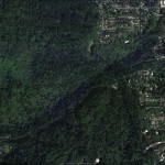
A google Earth image of the Macleay Park area appears below:
Copyright 2012 Peter F. Flynn. No usage permitted without prior written consent. All rights reserved.
